Any text-based digital content that you create, whether documents or webpages, should be made with accessibility in mind, to enable anyone to “read” your content, regardless of ability or need for accommodation. For text, this generally means making sure that all content is machine readable so that people with vision impairments can access it with screenreaders; people with reading or learning disabilities can adapt the text; and people can use translation software if needed.
Watch the video or read the article to learn easy ways to make your content accessible.
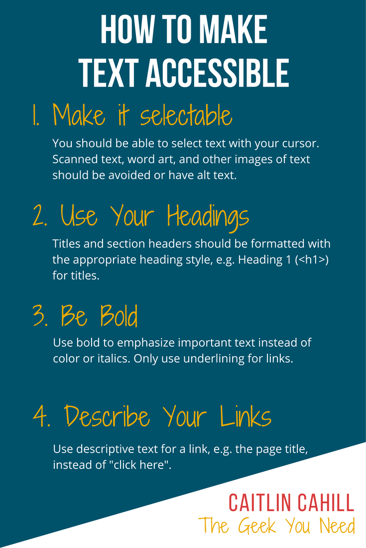
Make It Selectable
Text that can be selected with a cursor is accessible to screen readers/voice-overs and other assistive technology, like translation and dictionary software. Images of texts, such as word art, screenshots, or infographics are not accessible, as a screen reader would not be able to read the contents. Selectable text can also be copied and/or edited to be adapted to a user’s personal needs, e.g. increasing text size or changing font.
If you must include non-selectable text, provide a text alternative via alt text, OCR, and or captions.
Add Alt Text to Images
Alt text is text that is embedded in the code of a digital image. While not visible, it is read aloud to people who are using a screen reader. Be sure to add alt text to any image that contains content; purely decorative images do not require alt text. Most text editors have a box for you to enter alt text when uploading or adding an image; sometimes this is also accessible by right-clicking on an image in your document or by an image format menu.
Alt text should describe the important contents of an image that a user who cannot see an image would need to know, such as text, numbers, and other data. Describing colors, location of objects, and other visuals is only needed when necessary to understanding the image.
 Bad alt text: 3-Day Weather Forecast
Good alt text: Minneapolis weather forecast for January 13th-15th. Saturday is sunny with low of -9 degrees, high of 4 degrees. Snow on Sunday evening with low of -6 degrees, high of 15 degrees. Cloud on Monday with low of -2 degrees, high of -13 degrees.
Note that describing the layout and colors of this image is not included, as it is unnecessary to understanding the forecast.
Now you can why it is beneficial to avoid text-heavy images and just use text to begin with; otherwise, you end up entering data twice.
Scan with OCR
If you absolutely must use a scanned document, make sure to use a scanner that has Optical Character Recognition (OCR), which will convert the scanned image to a text document. The quality of the OCR conversion depends largely on the readability and formatting of the original document. Handwritten documents or documents with complex, multi-column layouts may not convert well. Always proof the resulting text and edit as necessary to remove extra line breaks (common with OCR) and fix errors.
For historical documents where the visual of the original document is important to retain, include a transcript of the document’s text along with the scanned image, instead of typing the entire document into alt text.
Use Paragraph Styles
Rather than manually styling titles and other important text, use built-in paragraph styles, which you can customize with your choice of font size, color, bolding, etc. Using styles will not only enable you to apply styling consistently across your document and save you time, paragraph styles increase the accessibility of text.
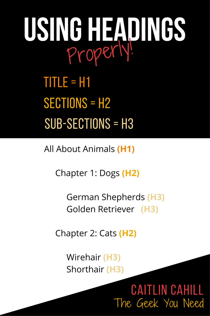
Headings
All About Animals (H1)
Chapter 1: Dogs (H2)
German Shepherds (H3)
Golden Retrievers (H3)
Chapter 2: Cats (H2)
Wirehair (H3)
Shorthair (H3)
Adding section headings to your document will create a table of contents for screen reading software that enables a user to skip to a specific section of a document, much like a person might visually scan a document. These can also be used to automatically generate a clickable table of contents in your document.
Heading 1 (H1) should be used only once in a document, for the title. Online content management systems like blogs usually automatically make a post title Heading 1. Other heading levels – heading 2 (H2), heading 3 (H3), etc. – should be used for sections and subsections, respectively. For example, all of your sections headers should be H2.
To make a heading, highlight the section name with your cursor and select the applicable heading level from your text editor menu.
Bullet Lists
Like headings, using the bullet list format (instead of manually typing and tabbing list number and bullets), is easy for screen readers to navigate. To make a group of items into a list, click the bullet ( ) or number list ( ) icon in your editor’s toolbar.
Be Big and Bold!
Text Size & Spacing
To ensure your text is readable, you need to choose a size that is large enough to see – what that size is will depend on the type of document you are creating and the font you are using.
Most standard serif and sans-serif fonts like Arial and Time New Roman are readable at 12 pts/px, however, 16 pts/px is advisable for digital texts like webpages due to eye strain from screens. Text on slide presentations that will be projected for an audience should be at least 30 pts/px, or higher for large rooms.
Adding a bit of space between lines also increases readability. Using a 1.5 line height is good for most text – printed or web. Also consider adding a space between paragraphs on digital documents, which is a setting in most text editors (don’t just return down to add space!), including Word and Google Drive.
Contrast Colors
The contrast between your text color and the background is also an important factor in readability. Use dark colors on light backgrounds and light colors on dark backgrounds; black text on a white background is best, and you should never use light yellow on white or grey text on black.
If you’re not sure, you can use WebAIM’s Color Contrast Checker to see if your text colors have enough contrast.
Emphasize Text with Bold
When you need to emphasize part of a text, using bold is best. Underlining text on a digital text can be mistaken as a link, and italics can be hard for people with reading disabilities to read. While you can also use color or highlighting to emphasize text, don’t rely on it as people who are color blind may not see the difference, i.e. if you use color, also use bold.
Don’t go overboard with bold either – if everything is bold, nothing stands out!
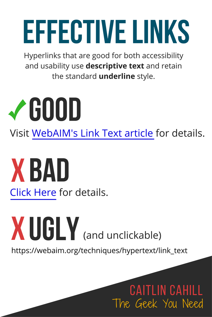
Describe Your Links
Any and all hyperlinks should have descriptive text to tell a user where the link goes.
Do not paste a link directly into a document. This is not only ugly, but a link may break if it goes onto multiple lines. In some cases, a link pasted into a document might not be clickable, requiring a user to copy and paste, which may lead to errors.
Instead, type a descriptive name of the link (the name of the linked webpage is usually good), highlight the text, then click the link button in your editor’s toolbar to add your link.
Never ever name a link “Click here”, especially if you have more than one link per page. This is not only bad usability for all users, and there is no indication as to where the link goes, but if a user using a screen reader is skipping across links, they will not know which link is which.
It’s also important to keep a link’s underline style for those who cannot see color.
Bad: Click here to learn more.
Good: Accessible link text and appearance by WebAIM
For more information about text accessibility, visit WebAIM’s Resources page.